
Feature implementation case study
A standalone analysis evaluating a well-liked startup's absent functionalities and an individual challenge to expand design and entrepreneurial problem-solving
Business problem
A customer need
Gathering hangout ideas are enjoyable, yet individuals continue to utilize different applications for discovering new events to go to
Design Goals
The direction to go
Integrate new events discovery feature within existing interface
Add to in-app experience
Build product loyalty
Use current design system
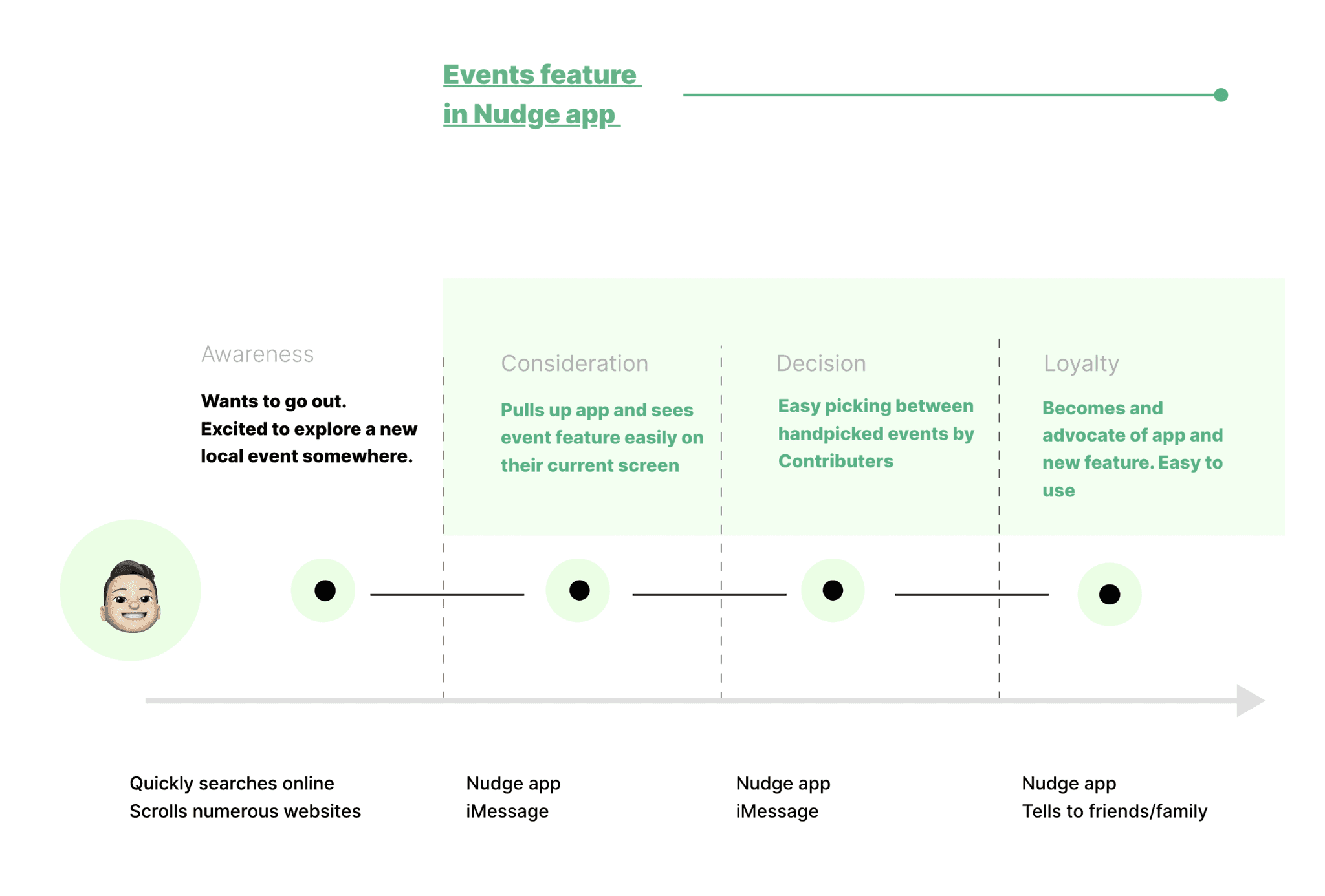
A quick customer journey used to map the opportunities
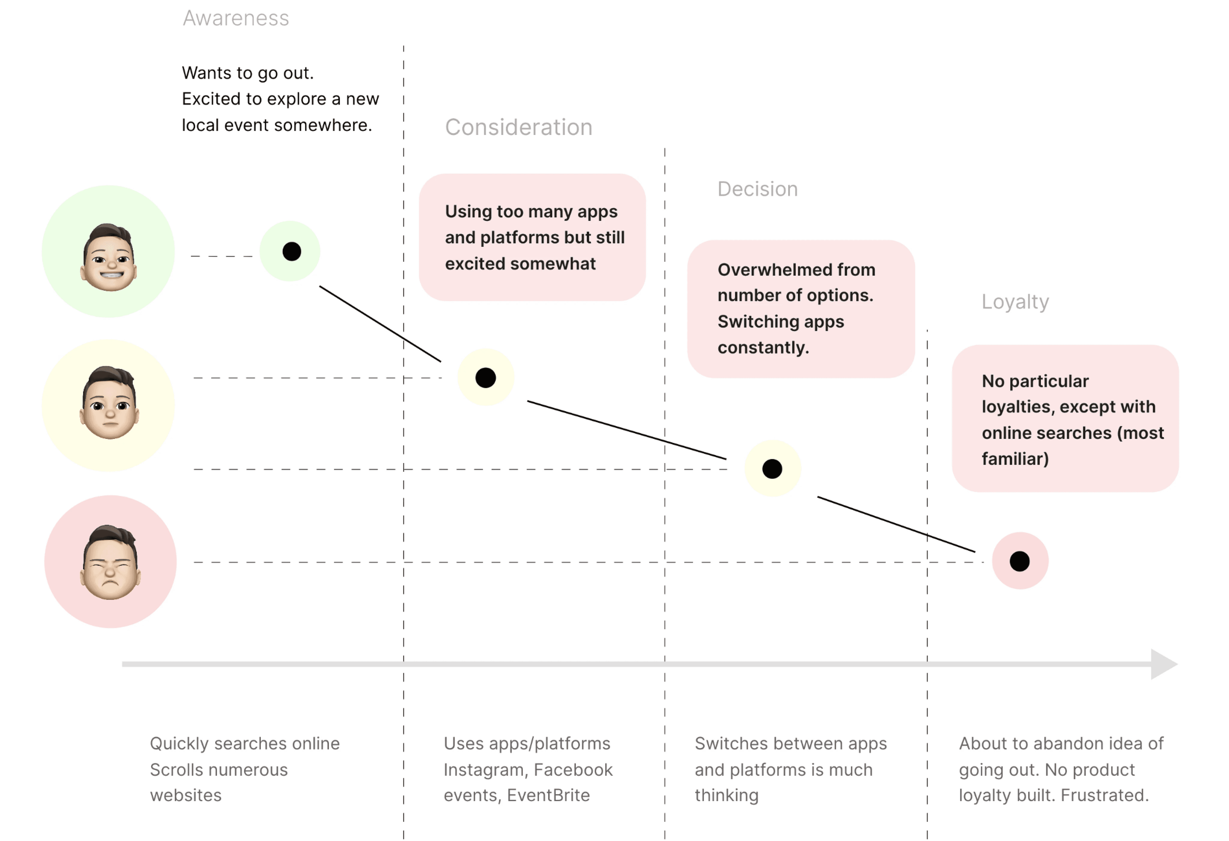
Why was this helpful at all?
It showed where The Nudge app could use improvement in the customer experience and improve retention, particularly by solving a user need to look up events straight from the app itself.
Researching directions
Exploring three positioning options to make it easy to find and use within the current application
Users need to use this feature often
In the real-world, I'd present these wireframes to the senior designer and have a sit-down chat about what's the easiest for the devs and the users.
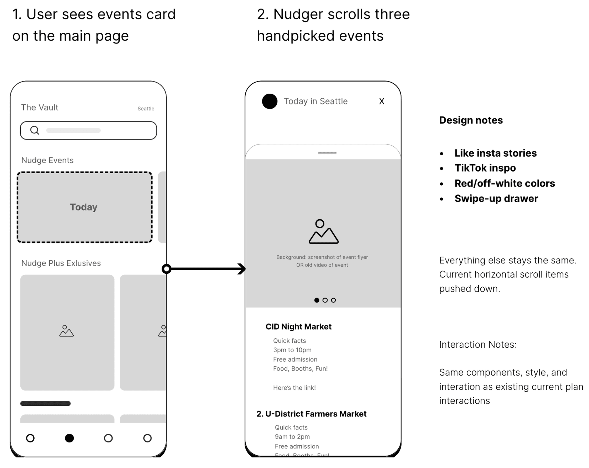
I realized there could be a chance to make the new events feature prominent
But knowing that the core feature of the app are hangout plans created by contributors, then blending it it as an additional add may be better.
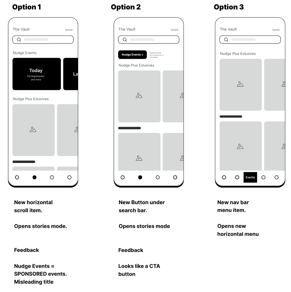
The winner - Including the events page as a new nagivational element
On brand design and user preferences
Wireframing assisted in defining content groupings and locations; here the focus shifts to finding the right on-brand presentation.
Event component
Cleaning up UI design for event components for clarity
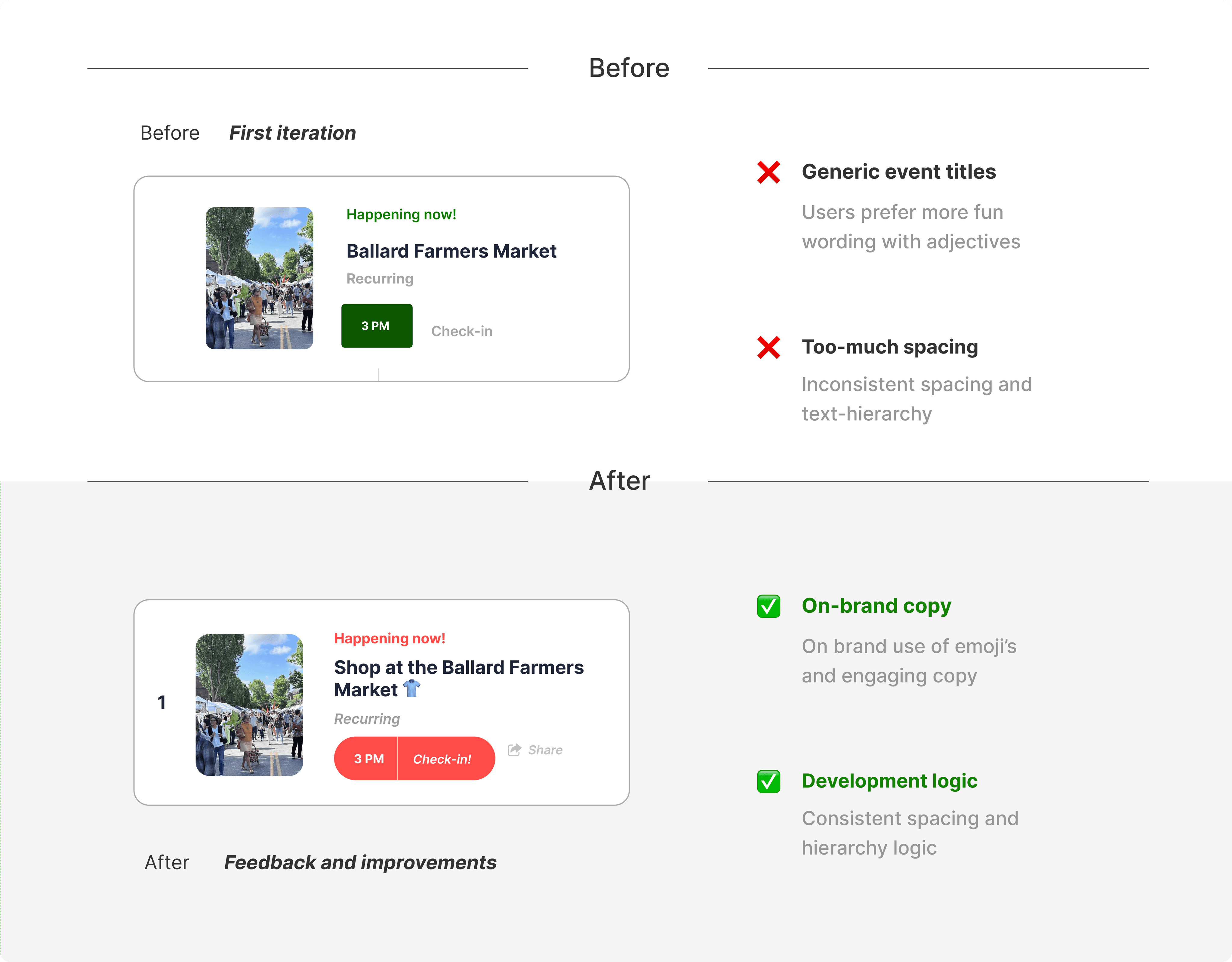
The main events page
Details from users revealed missing imagnery and social features the brand loves
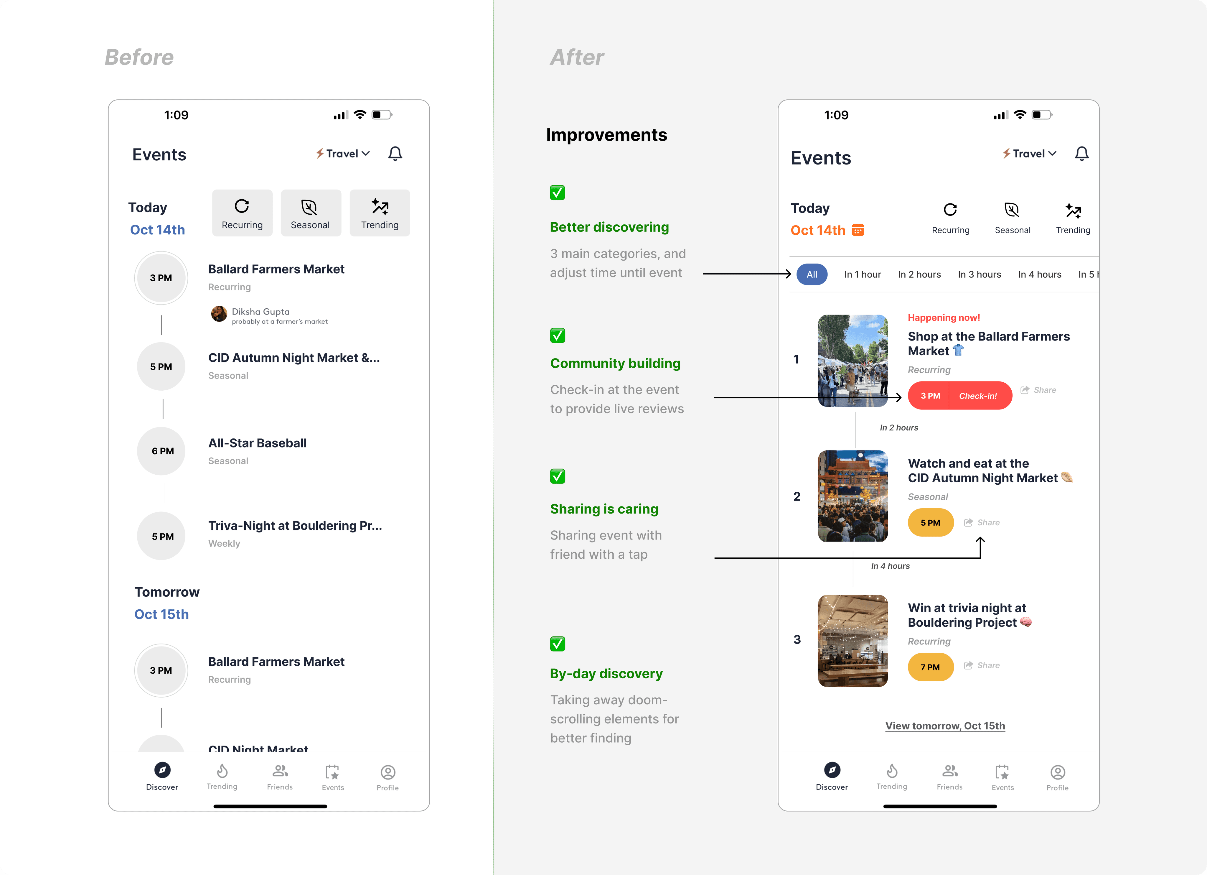
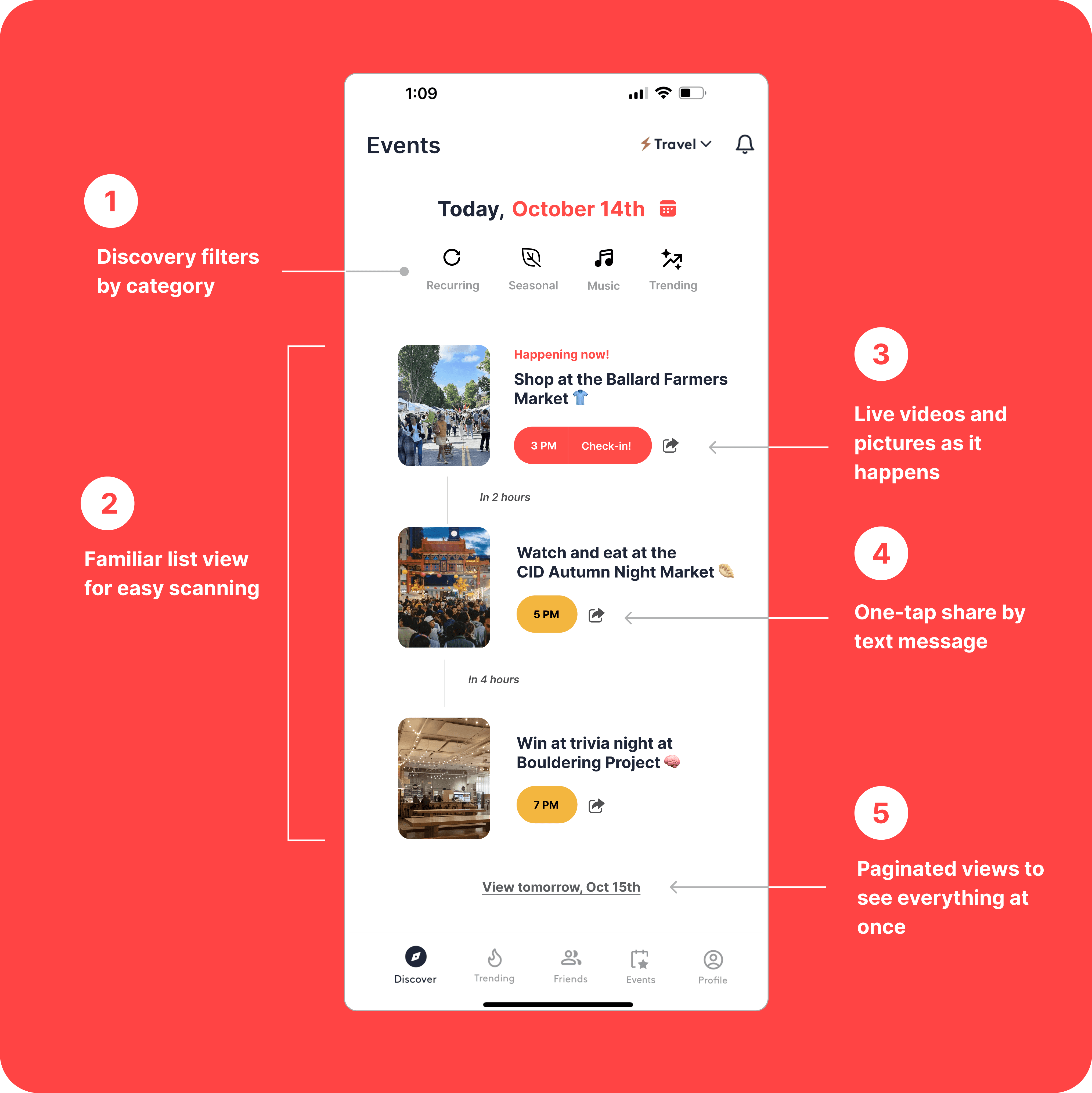
Final implementation proposal
Keeping it simple by taking cues from the current design language
Feeling of fun and friendly (on-brand)
Community building through check-ins
Easy to share
Comfortable interface
Revisiting the updated customer journey map
I ran my thinking with Senior Product Design mentors who always reminded me to always think about the business details in every design decision
Learning and reflections
They also taught me to always think ahead AND the bigger picture. Here are some of things that I always now consider as a part of any product design task◡̈
Engineering considerations
UI hyper care and taking care of tickets
Keeping devs in the loop weekly
Adhering to design system constraints
Business/design ROI
User satisfaction rating 1 (poor) to 5 (great)
True/False qualification for user buy-in
Potential Beta testing before full release
User retention metrics and event check-in quantity